Case Study
The TIBCO Platform was a project I had been wanting to do for a few years while at Cloud Software Group. Over the years, the "new" platforms were mainly iterations of the past platforms. Instead of an iteration, I was challenged with a change at the core of the existing platform. Simplifying how users would use TIBCO software to build anything in a centralized interface.

Problem
Create a centralized interface with collaborative experiences for three types of users IT operators, business technologists, and developers. Combine the TIBCO software into a unified offering.
● Problem: In the past, TIBCO included many different capability ecosystems, where tasks & assets behaved very differently. This required users to learn multiple (sometimes contradictory) mental models & behaviors, and no single user could ever be an expert in the entire TIBCO ecosystem.
● Problem: TIBCO products are meant to be used by enterprise teams consisting of users in diverse roles handling diverse tasks, but our current products do little to facilitate collaboration between those users.
Design
(Task 6) As an operator, I want to check the health of my applications/capabilities (Spotfire, Messaging, etc.) so I can address potential issues and ensure that everything is working properly.
(Task 7) As an operator, I expect that data from the Data Planes that are of the same type (examples: cpu, memory, services, API, Logs) to be rendered consistently in the same manner regardless of where it is deployed.
(Task 14) As an operator, I want to dig into the details of a problematic app, so I can determine how to fix it. (metrics, logs, tracing spans)
(Task 15) As an operator, I want to be able to view the capabilities from any Specific deployments I may have.
Statement
Goals
_______________________
_______________
User Objectives
Other Goals
Create a single-pane-of-glass for users to manage and monitor their solutions centrally.
The platform must be able to meet users where they are, in the cloud, on the edge, or on-premise.
Accelerate app development faster, by easily Creating applications within the platform.
Quickly resolve issues with end-to-end observability.
Centrally discover & manage on-premise TIBCO assets.
Robust pre-built and customizable templates for users.
User
Stories
______________
Platform Design
_________________________________________________
Design
__________________
Process
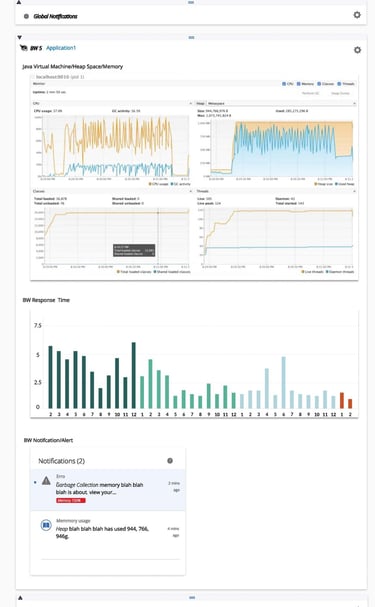
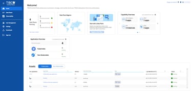
Legacy UI's
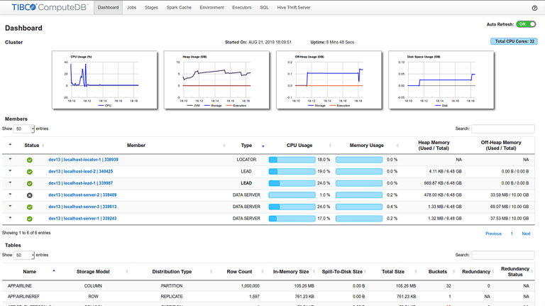
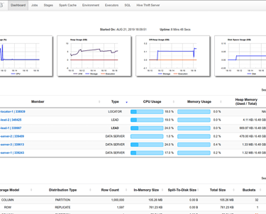
Having an existing platform and years of data on all TIBCO offerings helped me understand the scope of the design goals. Sifting through the documentation of the previous platforms and interviewing seasoned TIBCO product managers and developers along with customer interviews and feedback on what they wanted in the platform allowed me to compartmentalize the information into manageable areas.
1 / Discovery
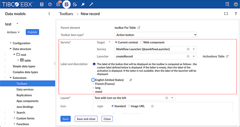
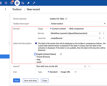
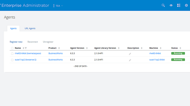
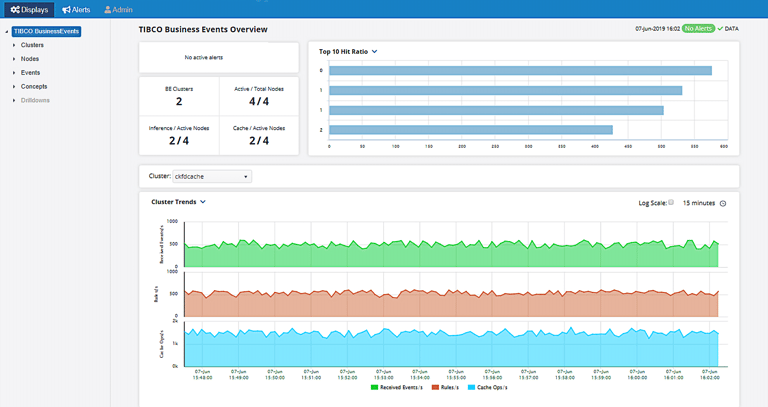
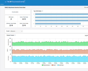
After much research and getting a sense of the scope of the project, I started looking at the existing UI. It quickly became apparent that there were many different UI depending on what task you wanted to accomplish in the platform and what application the user was in. Below is a showcase of a few of the UI screens.
Documentation
Reading through the documentation of the previous platforms was essential in understanding the platform's history of how and why clients use TIBCO, it informed me on what was needed to achieve the goals of the user. It also helped me to better understand the persona's wants and needs on the new simplified cloud platform.
2 / Define
In this case study, I wanted to showcase a competitive analysis that helped in the decision-making process of design. Along with the architectural flow, tasks the users performed gave me the insights to design diagrams to share with the teams to build the wireframes for the platform that incorporated the main UX position of consistency across the platform ecosystems, and collaboration between users and systems, and customization fitted to the tasks the user needed to perform.
Competitive Analysis
Architecture & Control Plane Information Flow
User Tasks
Unified Experience
Wireframes
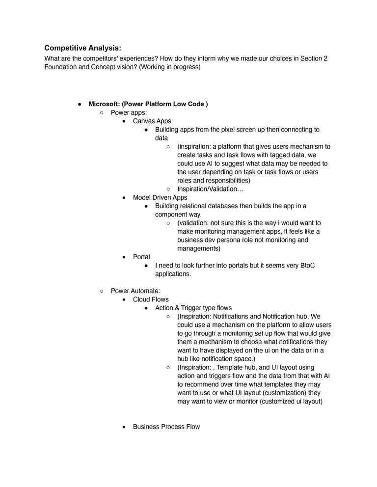
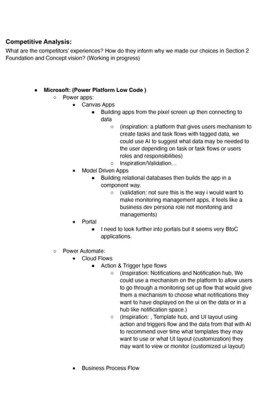
This page of the competitive analysis document helped reveal our competitors' strengths and weaknesses. This helped us identify gaps, position our platform, and showcase our advantages. It also showed us where our platform needed to improve.
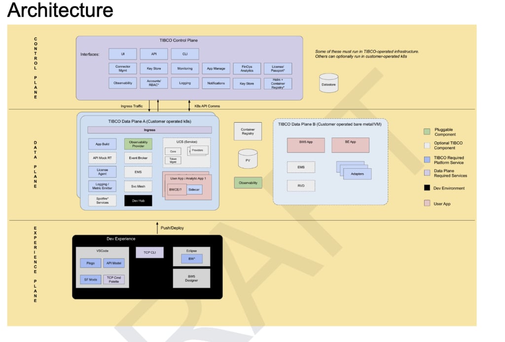
The architectural drawing that we came up with helped in designing the flow of information that the user needed to interact with the platform on the control plane, and the data plane. This start gave us enough information to work on the user's needs and how we could convey the needs to the teams in diagrams and displays.
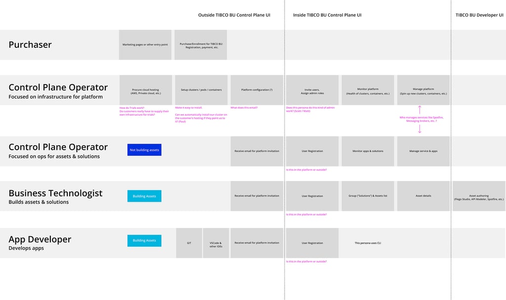
After identifying the users of the platform I wanted to corollate their tasks with where it would fit in the Control Planes and Data Plane. Below is a diagram I created to visualize the information. Soon after in the design and development process we simplified the Users to 3 and created the personas that would be needed.
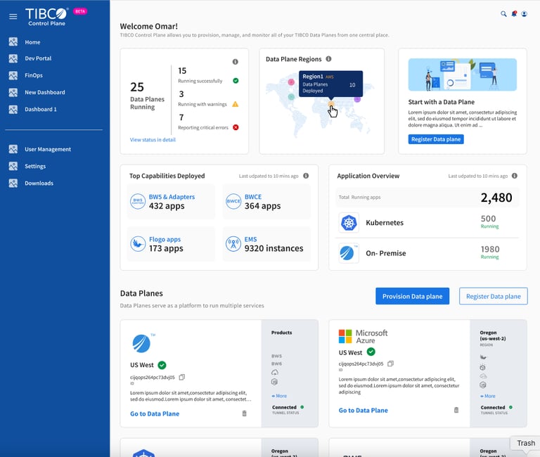
These wireframes were used to get approvals and the team's buy-in and support. which is needed to complete any initiatives. I would consider most of these Hi Fidelity Wireframes.
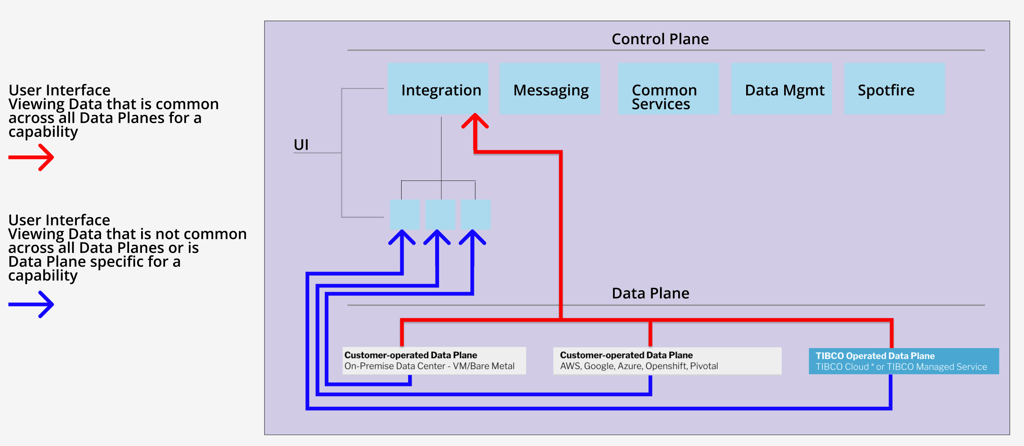
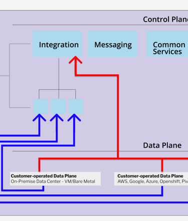
With the User's objectives and the Architecture of the platform ready, I wanted to get a clearer picture of how the Control, Data Planes would view data and its flow. Below is an early diagram I created to view and understand the flows.
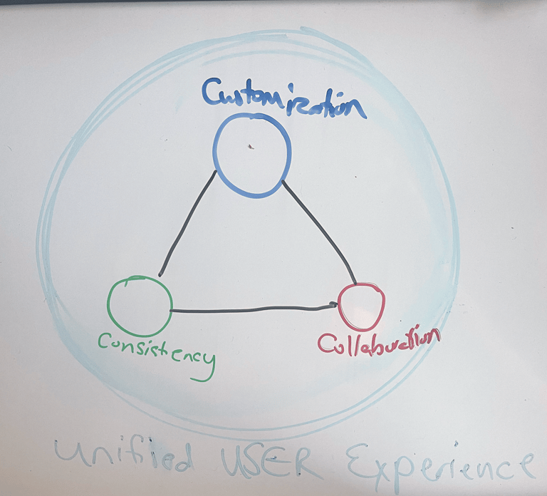
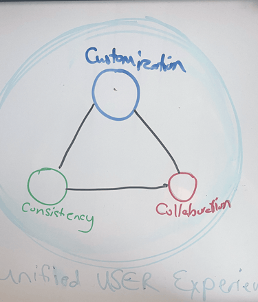
I had enough information to start to think about what unifying ideas and principles the teams could rally behind. Below is an early concept of 3 guiding principles in this project. You will see these ideas resurfacing in the design, documentation, and marketing campaigns and use cases online regarding the platform.
Evolution of the Platform
The best-laid plans change and evolve. It happened with the platform. I wanted to include the images showing some of the changes. As a Strategist and Project Manager, you have to be flexible and adapt to changes, it is not a nice to have, it is a must in a fast-moving environment. I added an early-stage concept of the 3 main areas of the platform and a finalized version released for marketing purposes.

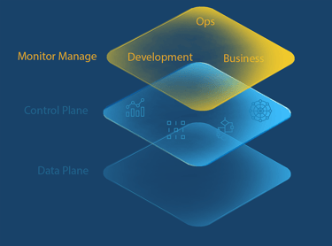

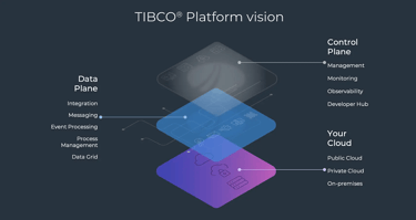
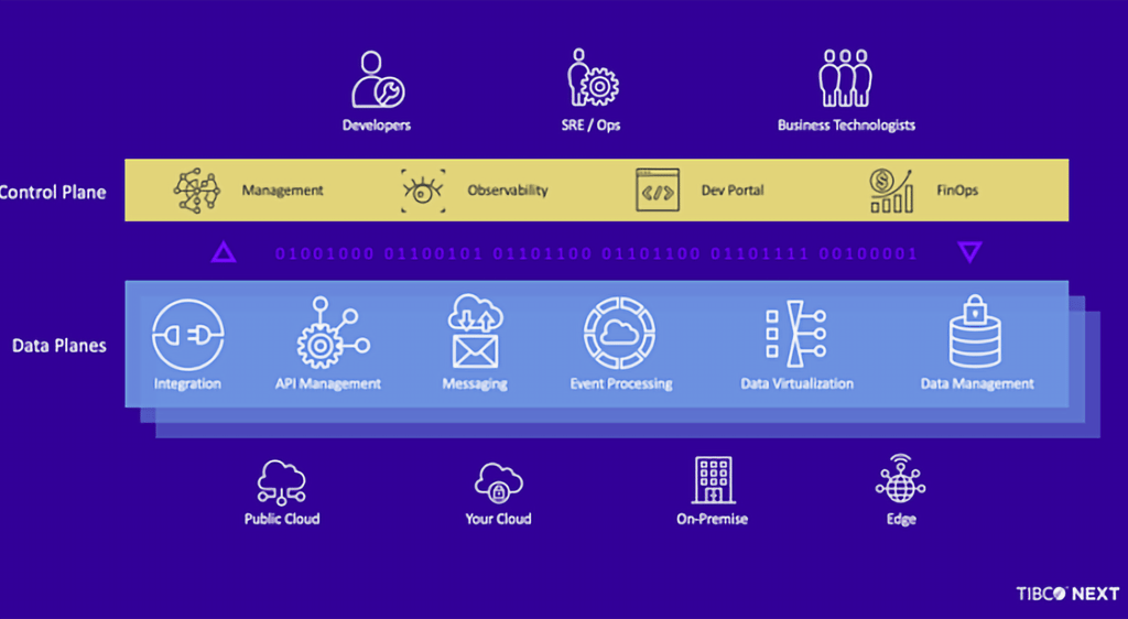
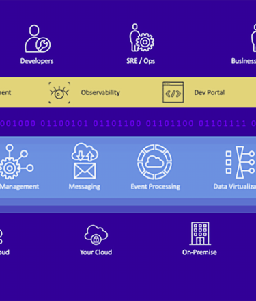
The Planes evolved and added capabilities or removed capabilities, Users were simplified and developed into 3 persons. Even the icons were adapted after user testing, allowing the overall TIBCO ecosystem to be consistent in its Iconography.

3 / Ideate
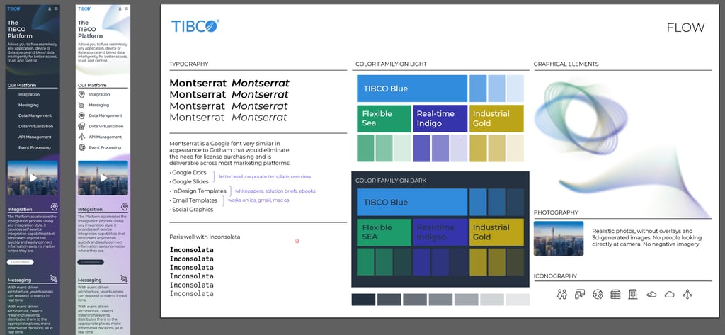
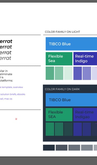
As mentioned earlier the iconography and visual communication style had to be aligned for consistency across the TIBCO single ecosystem. With the work and development already implemented in other projects the visual style was very quick and relatively easy to implement into the platform.
Moodboard
This was the mood board we shared with the teams working on this initiative.
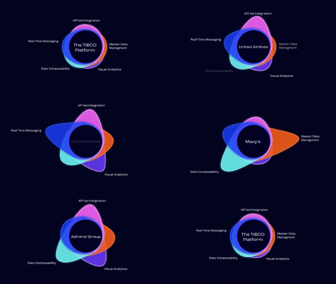

Platform Capabilities
I wanted to showcase the TIBCO platform with a simple motion example, regardless of vertical or needs. It needed to appeal to the three personas, operators, developers, and business technologists.
4 / Designs
The final designs, and implementing of the platform.
Final Design
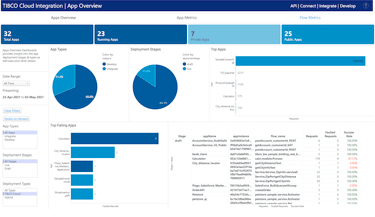
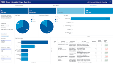
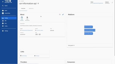
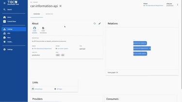
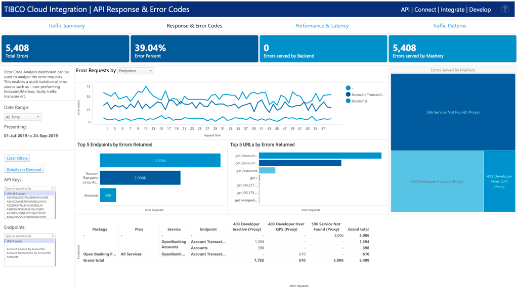

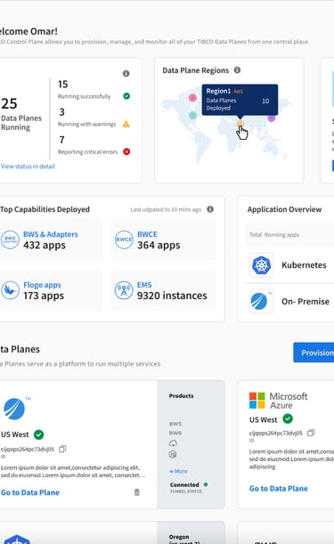
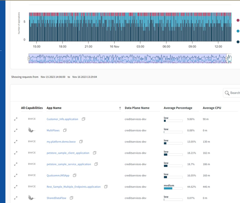
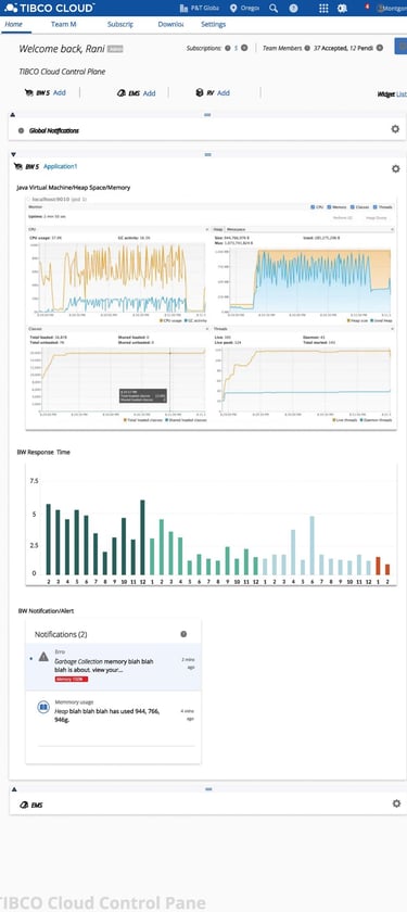
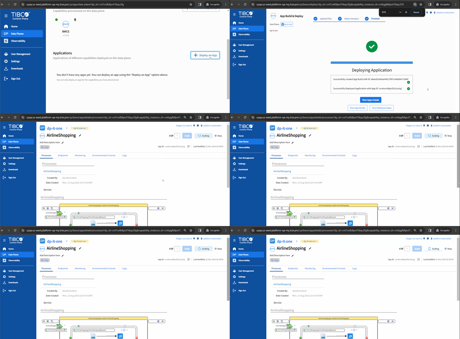
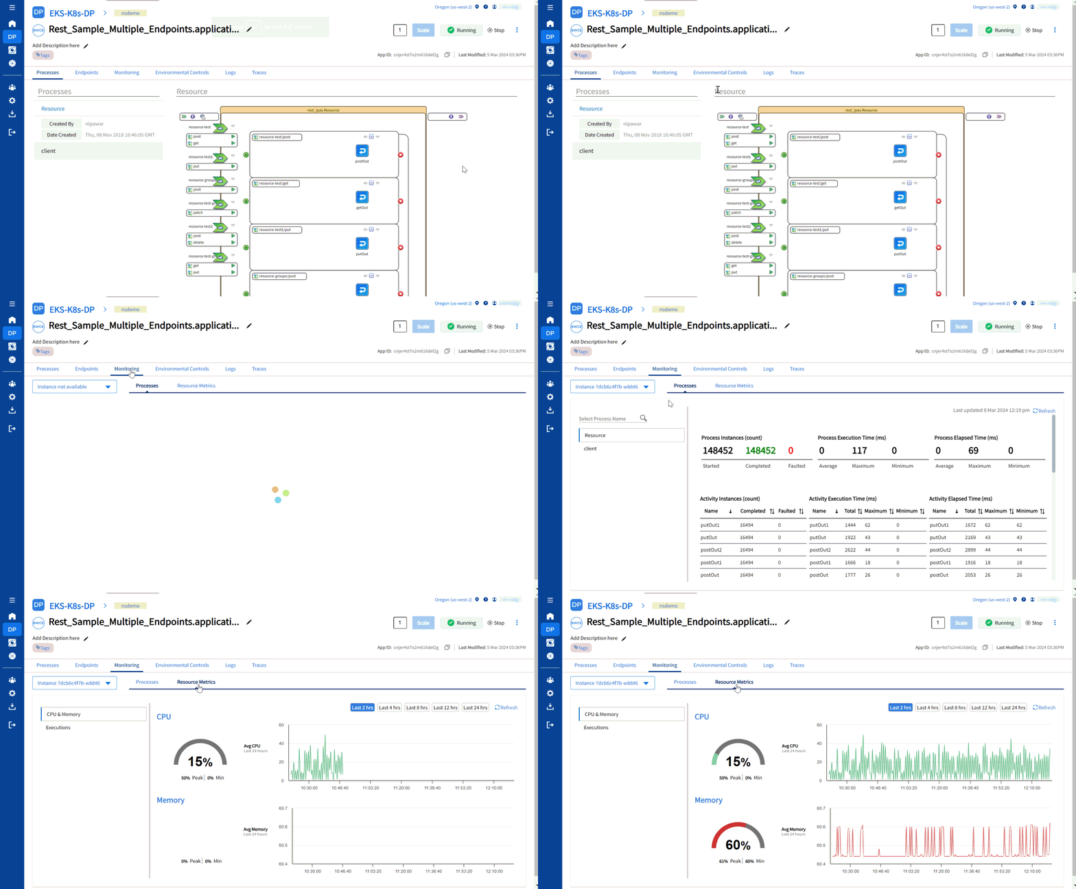
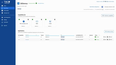
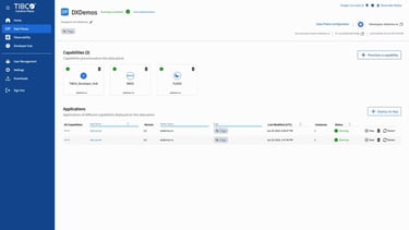
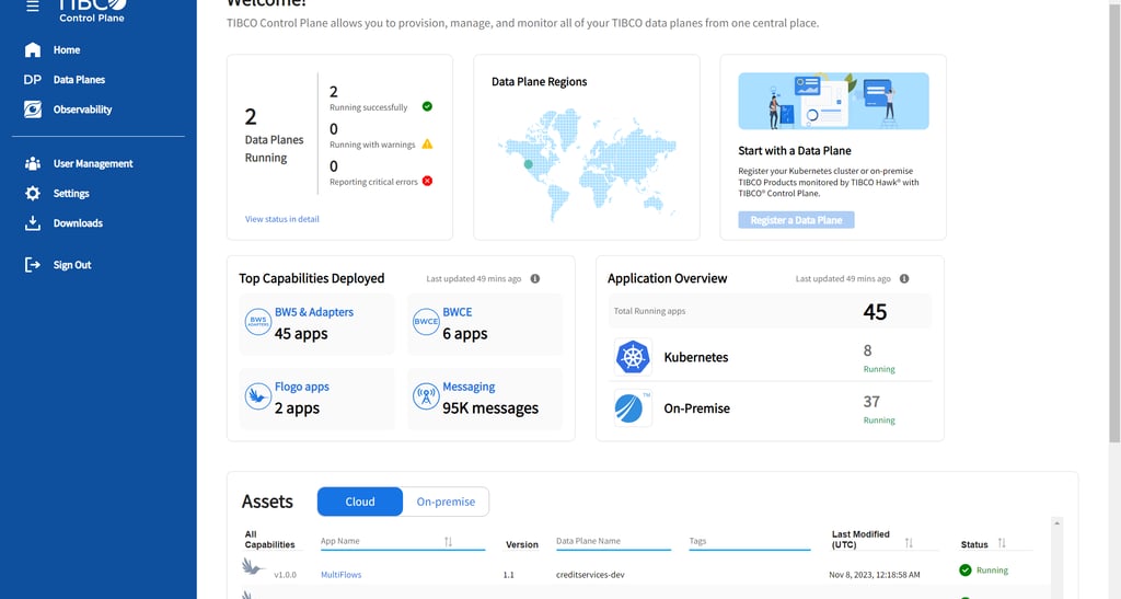
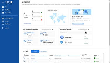
These are a snippet of UIs from various parts of the platform from landing page to monitoring page. Since you need to sign up to the platfrom I added some .gif images to show the platform in action.



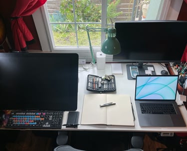
This is my workspace. How can we work on something great!
Jay's expertise in project management and user experience transformed our project. His strategic insights and attention to detail made a significant impact on our success.
★★★★★
★★★★★
Jay's expertise in project management and user experience transformed our project. His strategic insights and attention to detail made a significant impact on our success.


Alex Smith
Alex Smith
Project Showcase
Explore my work as a project manager and UX strategist.


